
Being the mighty band of true creatives that we are, one aspect of the job that we particularly enjoy is working with a client who puts our creative muscles to work developing branding/identity/design and logo concepts. Recently we were given the latitude to develop the brand identity, logo, packaging and messaging for an exciting new wellness brand.
The new brand’s roots trace back centuries ago. Moringa is a plant used in countries such as Zimbabwe and India as a supplement for all types of ailments. The plant has been used for centuries to help with inflammation, indigestion and other ailments, but more recently, the plant is being used as a healthy supplement to increase cognitive capabilities and overall health. Moringa has:
- 7x the vitamin C of oranges
- 2x the protein of yogurt
- 3x the potassium of bananas
- 3x the iron of spinach
- 4x the calcium of milk
- 4x the vitamin A of carrots
This nutritional plant is a commodity in other parts of the world, but is somewhat new to the U.S.

The challenge: create a category of moringa-based brands to be sold in the American wellness market.
[cue the coffee pot brewing, brainstorming and passionate discussions]
In creating a brand identity, two primary elements must be considered before any design-oriented work begins:
- Identifying the true essence of the product and its key differentiator
- Understanding the primary buyer and what he/she cares about
We worked closely with our client, Bonvera (a premium health and wellness company) and partners to understand the differentiated elements of their new product. This moringa is sourced from farms in Zimbabwe as part of a non-profit partnership to help local farmers redeem an honest income for their natural resource. Farmers are trained in sustainable farming practices, so their families can reproduce multiple crops for generations to come. Zimbabwean moringa is known to be the world’s most premium version of the plant.
Our next investigation was focused on the target buyer. While many people use vitamins and supplements of some sort, the primary consumer for this category of products will be women age 25 – 45. We developed a buyer persona, named her Mary and focused on what Mary cares about.
The result of identifying the true essence of the product and understanding Mary is a Brand Architecture, which reflects the intersection of the brand and its customer. In other words, a more focused challenge – create a brand that:
- Represents the essence of the Zimbabwean moringa
- Connects to key differentiators of the plant
- Aligns with key pillars of the brand: Healthy Living, Empowering People, Premium Quality, Agri-Conservation
- Provides opportunity for significant customer loyalty
- Belongs to the overall wellness market but stands apart from other herbal brands
- Offers creative framework for multiple brands within the moringa category
In understanding the direction of the brand, we wanted to develop a naming framework that was flexible enough to accommodate multiple brands within the category and provide a scalable model to implement new products over time. Research about Mary pointed us toward two naming paths: Functional Result or Abstract Playful. There is a science to naming but also an art. Through additional buyer persona research, we decided to pursue the Functional Result naming approach.
One aspect of naming that is overlooked is trademarks. In pursuit of the perfect name, we had to consider existing trademarks and were forced to move in new directions as a result. You don’t want to find out a year down the road that you must give up the name you love; oh, and there’s potential fines to pay as well.
With Brand Architecture and Naming direction confirmed, we then developed visual brand identity options for the client to consider. It is important to fully understand the product before designing a look for it. Our client offered some initial guidance on the look, feel and attitude of the brand, but the rest was left up to us. We developed a number of options and landed on a design that maximized all of the considerations above. And with that, the birth of Kutano. Kutano is a hybrid of two Zimbabwean terms: Utano (health) and Kura (growth).
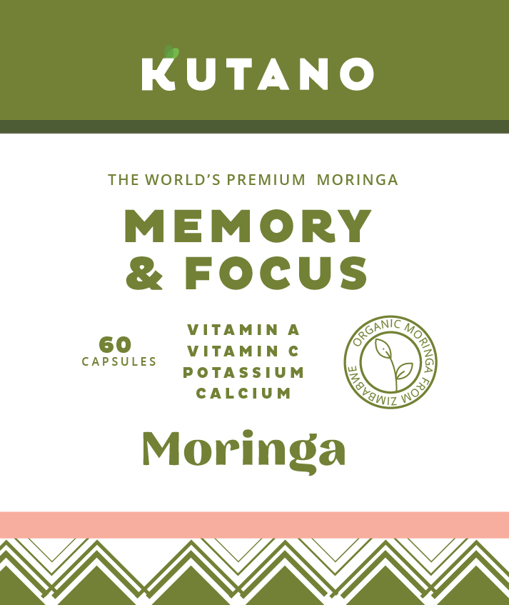
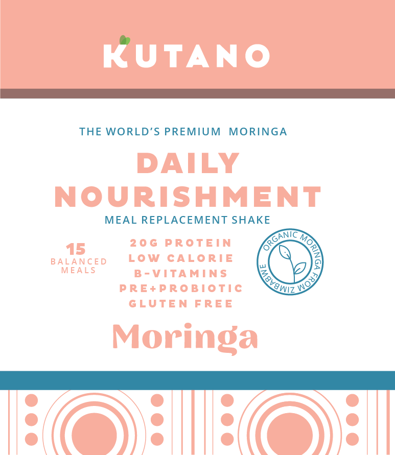
The first brand to market within this new category is a cognitive supplement in a market category known as Nootropics. Based on the naming approach, we wanted to highlight the practical impact of the product: Memory & Focus. Soon after, Daily Nourishment will enter the market.
During the process Ackermann engaged a diverse sample of women in the target demographic to get their feedback on design and naming. That feedback was critical in identifying questions future consumers might have about the product, packaging, pricing, etc. Never underestimate the value of speaking with your future customers before, during, and after you go to market.
As happens when you fall in love with the perfect house, or the perfect person, we finally settled on a logo and messaging we could all be proud of that best represented our client and their products. We are fortunate to work with clients that give us the creative freedom to let their dreams come to life. Its especially exciting to see a startup transform from an idea on a napkin to a product on a shelf. Its something that never gets old and we can’t wait for the next opportunity to bring something new to life.

